
Handcrafted Logo Concept for a Neighborhood Coffee Shop
When creating the logo concept for Sunbean Coffee, I wanted to capture the feeling of a bright, welcoming neighborhood café. Inspired by modern independent coffee shops, the goal was to create a mark that felt warm, approachable, and memorable while reflecting the handmade nature of the business.
The logo combines three elements into a single symbol: a coffee bean, a rising sun, and the letter "S" for Sunbean. The result is a simple yet distinctive mark that tells the brand's story at a glance. The rising sun represents warmth, optimism, and the start of a new day, while the coffee bean grounds the identity in the café experience.
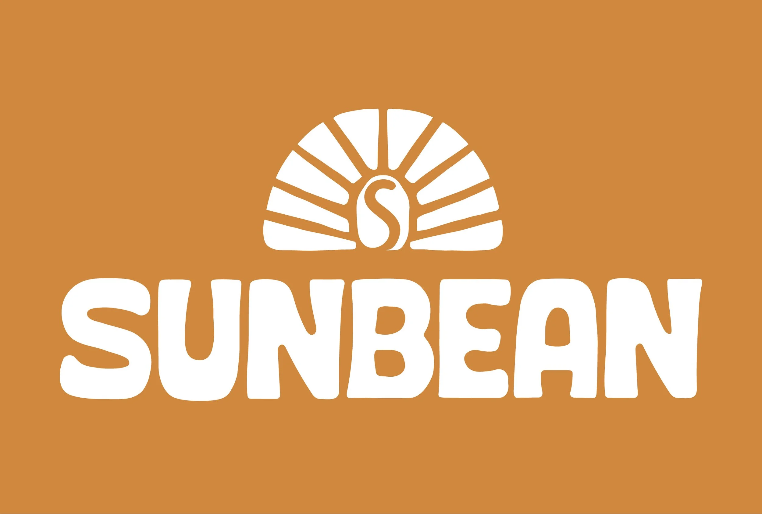
Rather than relying on a perfectly geometric logo, I chose a handcrafted approach with custom-drawn lettering and organic shapes. The slightly imperfect curves give the brand a more human feel, helping it stand apart from corporate coffee chains and connect with customers on a personal level.
The warm golden color palette was selected to evoke sunlight, freshly brewed coffee, and a sense of comfort. Paired with clean typography and minimal applications, the identity feels modern while remaining approachable.
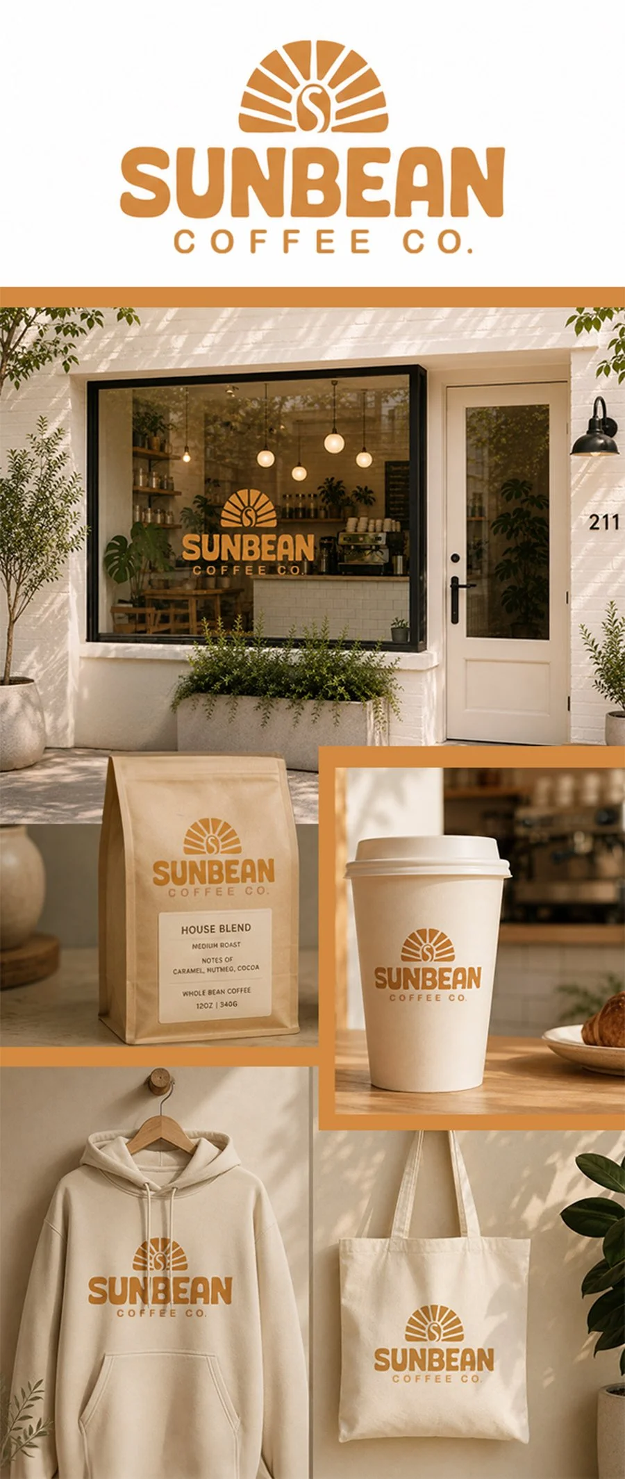
Generated mockups to quickly visualize what the logo application would look like in real life.
To bring the concept to life, I explored how the logo could extend across storefront signage, takeaway cups, tote bags, and merchandise. The flexible mark allows the brand to feel consistent across every touchpoint while maintaining the cozy, community-focused personality that defines a great neighborhood coffee shop.
This concept was designed as an exploration of how thoughtful, handcrafted branding can help small businesses create memorable experiences and meaningful connections with their customers.
Need a logo design for your business? Let’s talk: hello@theinkingrose.com